

The online world is moving fast. Use this simple framework to check if your website, SEO, and ads are ready for the next 12 months—and get a 30‑day action plan to upgrade your online presence.

Privacy rules are changing how websites and ads track visitors. Learn what this means for your small business and how to adjust your website, SEO, and ads so you can still get clear results—without creepy tracking.

AI is transforming websites, SEO, and online ads—but it doesn’t replace your brand. Learn how small businesses can use AI tools to get better results from their website, search traffic, and advertising without losing the human touch.
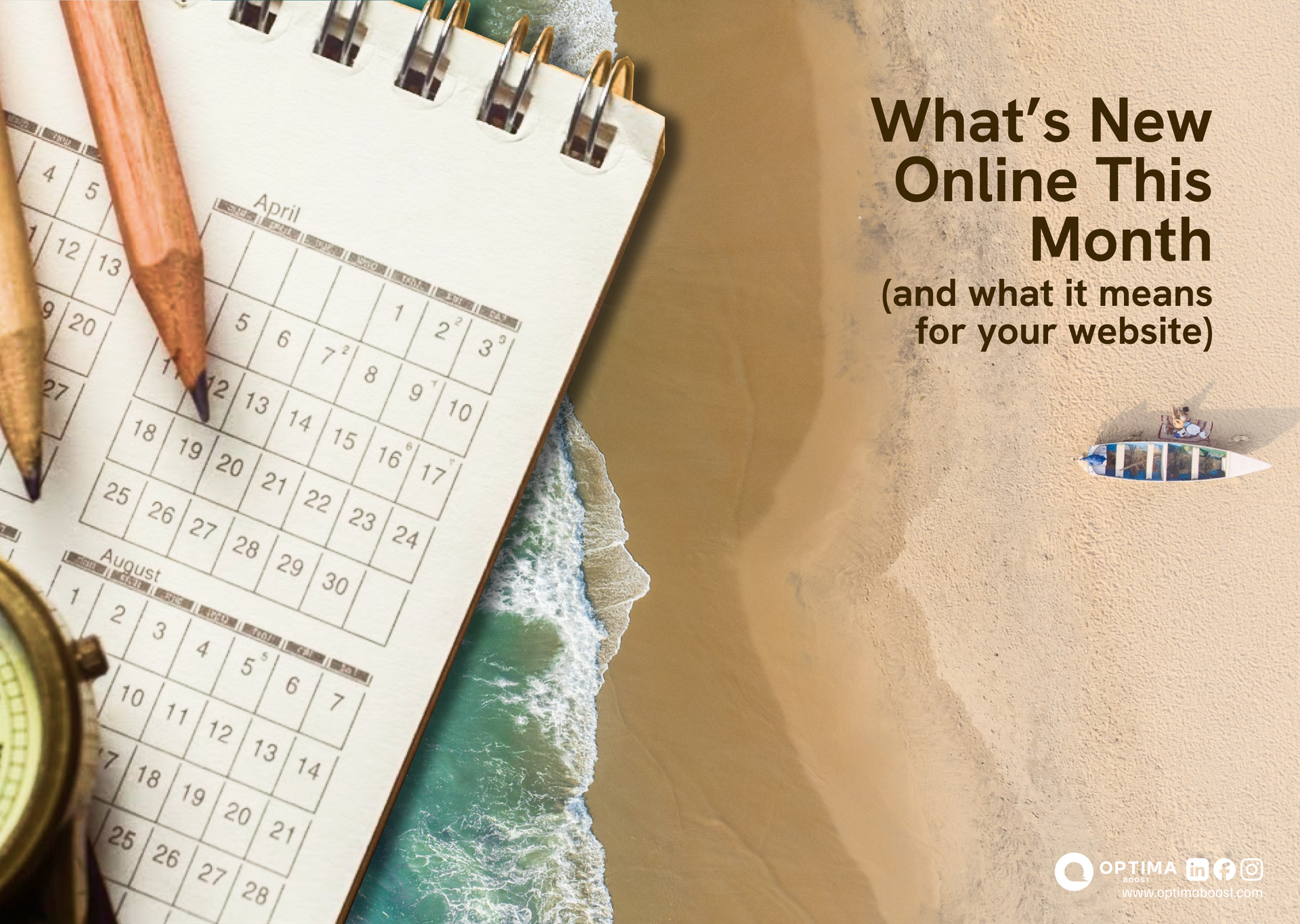
Keep your business ahead with our April digital roundup. Learn how new SEO, ads, and website trends impact your growth and get simple steps to stay competitive.

Local competition continues to grow as more businesses invest in their online presence. In 2026, customers are relying even more on search engines to find nearby services quickly and confidently.

A website should do more than look attractive—it should actively guide visitors toward becoming customers. Many small business websites receive traffic but struggle to convert that traffic into leads or sales.

Your website is often the first impression customers have of your business. Poor design can quickly damage trust and credibility, even if your services are excellent. In competitive markets, a weak online presence can cost you valuable opportunities and long-term growth.
Content marketing allows small businesses to attract customers by providing valuable information instead of relying only on advertising. By answering questions and offering helpful insights, businesses can build trust and generate consistent website traffic.

Websites are no longer just digital brochures. Today, they are becoming smarter, faster, and more personalized thanks to AI driven features built directly into modern web design.

San Jose businesses are feeling a quiet shift online. It’s not about flashy redesigns or chasing trends. It’s about staying visible, credible, and competitive as customer behavior changes faster than ever.
The online world is moving fast. Use this simple framework to check if your website, SEO, and ads are ready for the next 12 months—and get a 30‑day action plan to upgrade your online presence.
Privacy rules are changing how websites and ads track visitors. Learn what this means for your small business and how to adjust your website, SEO, and ads so you can still get clear results—without creepy tracking.
AI is transforming websites, SEO, and online ads—but it doesn’t replace your brand. Learn how small businesses can use AI tools to get better results from their website, search traffic, and advertising without losing the human touch.
Keep your business ahead with our April digital roundup. Learn how new SEO, ads, and website trends impact your growth and get simple steps to stay competitive.
Local competition continues to grow as more businesses invest in their online presence. In 2026, customers are relying even more on search engines to find nearby services quickly and confidently.
A website should do more than look attractive—it should actively guide visitors toward becoming customers. Many small business websites receive traffic but struggle to convert that traffic into leads or sales.
Your website is often the first impression customers have of your business. Poor design can quickly damage trust and credibility, even if your services are excellent. In competitive markets, a weak online presence can cost you valuable opportunities and long-term growth.
Content marketing allows small businesses to attract customers by providing valuable information instead of relying only on advertising. By answering questions and offering helpful insights, businesses can build trust and generate consistent website traffic.
Websites are no longer just digital brochures. Today, they are becoming smarter, faster, and more personalized thanks to AI driven features built directly into modern web design.
San Jose businesses are feeling a quiet shift online. It’s not about flashy redesigns or chasing trends. It’s about staying visible, credible, and competitive as customer behavior changes faster than ever.