What a Brazilian Waxing Studio Taught Us About Building High-Converting Service Websites
Service Websites Need More Than Pretty Design
A lot of service business owners think, “As long as my website looks nice, I’m good.”
But in reality, a good-looking site that doesn’t bring in bookings, calls, or inquiries is just an online brochure.
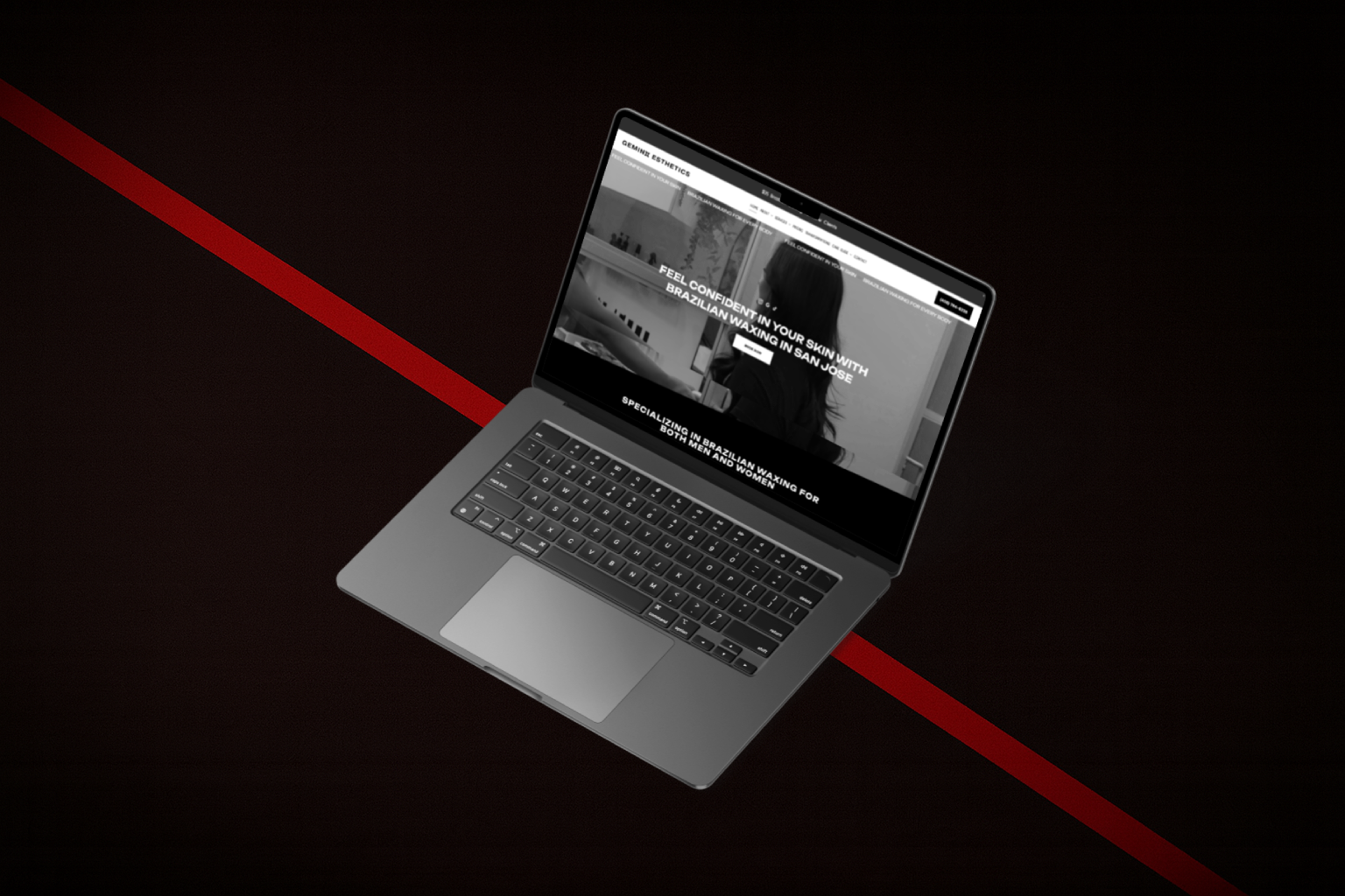
Recently, we worked on the website for Geminii Esthetics, a Brazilian waxing studio in San Jose, CA. While the project was specific to a waxing business, the lessons apply to almost any service-based brand—salons, spas, home services, studios, and more.
Here are a few things this project reminded us about what really makes a service website convert.

1. Say Exactly Who You Help and What You Do
One of the first things we focused on for Geminii Esthetics was clarity.
Instead of a generic welcome message,
the site clearly communicates:
- What they do (Brazilian and full body waxing)
- Who they serve (every body, all genders, all skin types)
- What visitors can expect (a confident, comfortable experience)
When someone lands on your website, they shouldn’t have to scroll or guess.
Within a few seconds, they should know:
- “Is this for me?”
- “Can they solve my problem?”
If your homepage doesn’t answer those two questions, that’s the first thing to fix.
2. Make Booking the Easiest Possible Action
For a service business, the main goal isn’t just “more traffic”—it’s more bookings.
On the Geminii Esthetics site, the booking options are always easy to find:
- A clear “Book Now” / “Make a Booking” button
- Options to call or text for people who prefer direct contact
- Repeated CTAs in key sections so visitors never have to hunt for the next step
Ask yourself:
- Can someone book from your homepage in just 1–2 clicks?
- Is your booking button visible on mobile without scrolling too much?
- Do you offer more than one way to book (online system, call, text, contact form)?
The easier you make it, the more likely people will actually follow through.
3. Use Your Website to Reduce Anxiety
Services like waxing, skincare, or even home repairs can make people nervous—especially if it’s their first time.
That’s why the Geminii Esthetics website leans heavily on comfort and reassurance:
- Friendly language that focuses on how clients will feel
- Clear explanations of what to expect from services
- Emphasis on professionalism, hygiene, and care
Think about your own clients:
- What are they secretly worried about?
- What stops them from booking today?
- What questions do you keep answering over and over?
Your website should answer those concerns before they even have to ask.
4. Let Your Clients Do the Talking
One of the strongest parts of Geminii Esthetics as a brand is the way clients talk about their experience—less ingrowns, feeling comfortable during Brazilian waxes, and recommending the studio to friends.
Instead of hiding those reviews on a separate page, we bring them into the main experience:
- Short testimonials near booking buttons
- Social proof that mentions specific results or feelings
- Star ratings and quick quotes that build trust in seconds
You don’t need dozens of reviews on the homepage. Even 3–5 strong, specific testimonials can make a huge difference.
5. Tell a Short Story About the Person Behind the Business
For many service brands, the owner is part of the brand.
In Geminii Esthetics’ case, Vyonna’s story matters: she’s a licensed esthetician who focuses on making clients feel confident and cared for, not rushed or judged.
On your own website, an “About” section or a small intro can:
- Make your brand feel more human
- Help visitors feel like they “know” you before they book
- Build trust, especially for personal services
You don’t need a long biography—just a short, honest intro about who you are, who you help, and why you care about the work you do.
6. Design for Thumbs, Not Just for Desktops
Many Geminii Esthetics clients are likely browsing on their phones: checking availability, finding the address, or quickly booking an appointment.
So the site is designed to work beautifully on mobile:
- Clean sections with short text
- Buttons that are easy to tap
- Simple, vertical scrolling with clear next steps
If you want to test your own site, try this:
- Open it on your phone
- Pretend you’re a new customer
- Time how long it takes you to find:
- What you do
- Where you are
- How to book
If it takes too many taps or too much reading, your mobile experience might be costing you leads.
7. Align the Online Experience With the Real Experience
The best compliment your website can get is:
“This feels exactly like your studio / office / service.”
That was our goal with Geminii Esthetics: to make the site feel like an extension of the real experience—warm, confident, and welcoming.
For your brand, think about:
- How does your space feel? Calm, energetic, luxurious, cozy?
- How do people describe working with you?
- Can your colors, photos, and wording match that feeling online?
When your brand is consistent from website to real life, people feel more comfortable booking and more confident referring others.
Final Thoughts: Your Service Website Should Work Like a Silent Team Member
The Geminii Esthetics project is a good reminder that a service website isn’t just there to “exist online.” It should act like a quiet but powerful team member:
- Explaining what you do
- Making people feel comfortable
- Answering common questions
- Guiding visitors toward booking
You don’t have to copy what a waxing studio does—but you can definitely borrow the principles:
- Clarity
- Ease of booking
- Trust
- A bit of personality
Want your service website to feel more like a booking machine than an online brochure?
We can help you redesign or refine your current site so it’s clearer, more comforting, and easier for clients to book—just like we did for Geminii Esthetics.


